

Healthy flour. Zenter Family
Client
Zenter Family
Zenter Family
Services
Express-research
Brand platform
Packaging design
Task
Our task was to create a brand of flour for the Zenter Family. It was important to highlight the motivating, inspiring nature of the brand, to create a design that could compete with other flour brands on marketplaces.
Zenter Family includes various types of flour (from wheat to corn and rice). Only natural ingredients are used in the composition. The brand saves the consumer’s time by sharing healthy recipes on social networks and the website.
Market research
Today everyone can find a product to suit their eating style. Despite this, traditionalism and utilitarianism can still be traced among the design solutions, both in design solutions and in constructs. The most popular solutions in the category: are characters, food zones, or simple graphics.
Consumers
Consumer demands for flour have changed. People look carefully at the content of gluten, and fiber, information about nutrients and vitamins, the location of HFCS, and glycemic index. But often consumers don’t understand the benefits of alternative flours. So it was necessary to bear the stigmas that will explain the advantages and benefits of the product: low glycemic index, does not cause heaviness.
Positioning
Changing your flour choices is one of the easiest decisions you can make. This is where everyone can start because flour is a basic product that we can find in almost any dish. Our brand creates the basis for change. It allows you to try new flavors and take the first step towards a healthy lifestyle.


Design idea
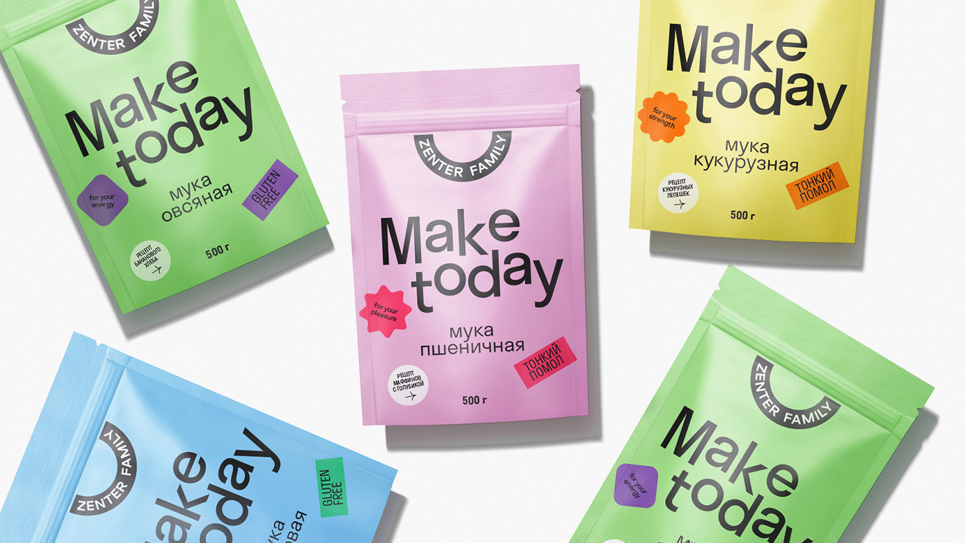
Make today
A goal seems more achievable when perceived as a sum of successive steps. The design reflected the philosophy of small steps. The brand motivates you to change and helps you become better.


Design
At the center of the design is bright typography with a motivating slogan. It resembles a ladder and reflects the idea of small steps toward a big dream. Playful graphics make it easier to understand. Minimalistic, light forms create a feeling of clarity and simplicity in the process.
Phrases also support a positive mood. Rice flour uses a rational message “for your health”, while traditional wheat flour uses a more emotional one – “for your pleasure”.
Palette
We use a bright color palette: shades of pink — for wheat flour, and shades of blue —
for rice flour.


The results
1. We have developed a brand of flour with a modern design that is easy to expand
by increasing the number of SKUs.
2. We created packaging that distinguishes the product on the market.
3. Today the brand is sold through its online store and on all marketplaces:
Ozon, Wildberries, Yandex. Market.


